

Blog Summary
Graphic design and color psychology are powerful elements in the visual world. Every logo, advertisement, or website we see influences our perception and emotions through strategic design choices. Understanding how colors impact human behaviour helps designers create compelling visuals that evoke the desired responses. In this article, we will explore the fundamentals of graphic design, the science behind color psychology, and the importance of choosing the right color palette.
The Fundamentals of Graphic Design
What is Graphic Design?

Graphic design is the art and practice of visual communication using typography, imagery, color, and layout. It is essential for branding, advertising, web design, and digital marketing.
Core Principles of Graphic Design:
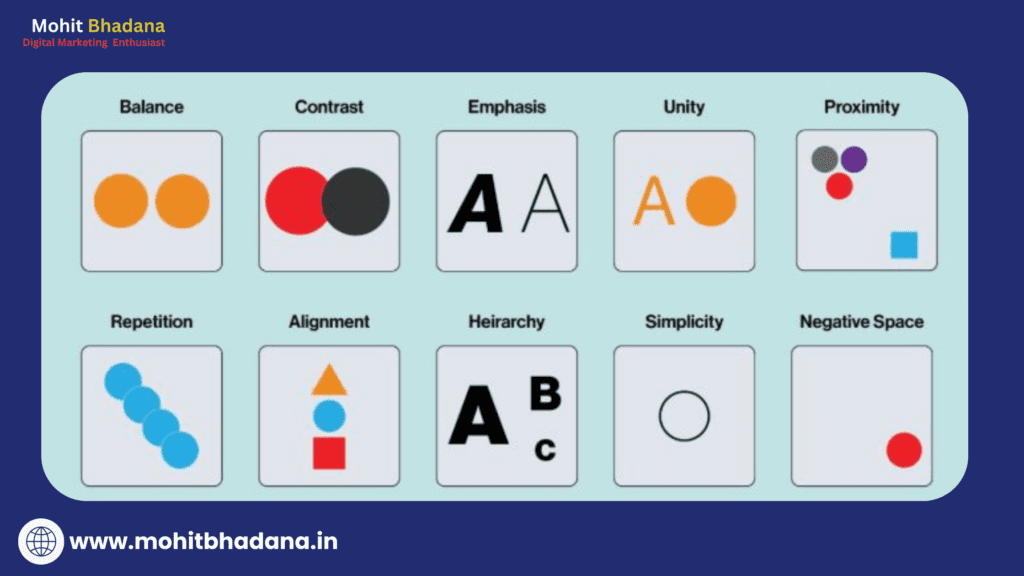
- Balance – Ensuring visual stability in a composition.
- Contrast – Enhancing readability and visual interest.
- Alignment – Creating a structured and organized layout.
- Repetition – Strengthening brand identity and consistency.
- Proximity – Grouping related elements to improve clarity.
Types of Graphic Design:
- Branding & Logo Design – Crafting unique brand identities.
- Web Design – Designing user-friendly websites.
- Print Design – Creating brochures, business cards, and posters.
- Illustration – Using hand-drawn or digital illustrations to tell stories.
Essential Tools for Graphic Designers:
- Adobe Photoshop – Image editing and manipulation.
- Adobe Illustrator – Vector design for logos and illustrations.
- Canva – Easy-to-use design tool for beginners.
- Figma – Web-based interface design and prototyping.
Understanding Color Psychology
What is Color Psychology?

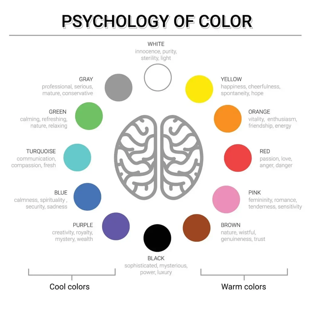
Image Source – www.jdsd.in
Color psychology is the study of how colors influence emotions and behaviours. Different colors evoke different reactions, making color selection crucial in design and marketing.
Common Color Meanings:

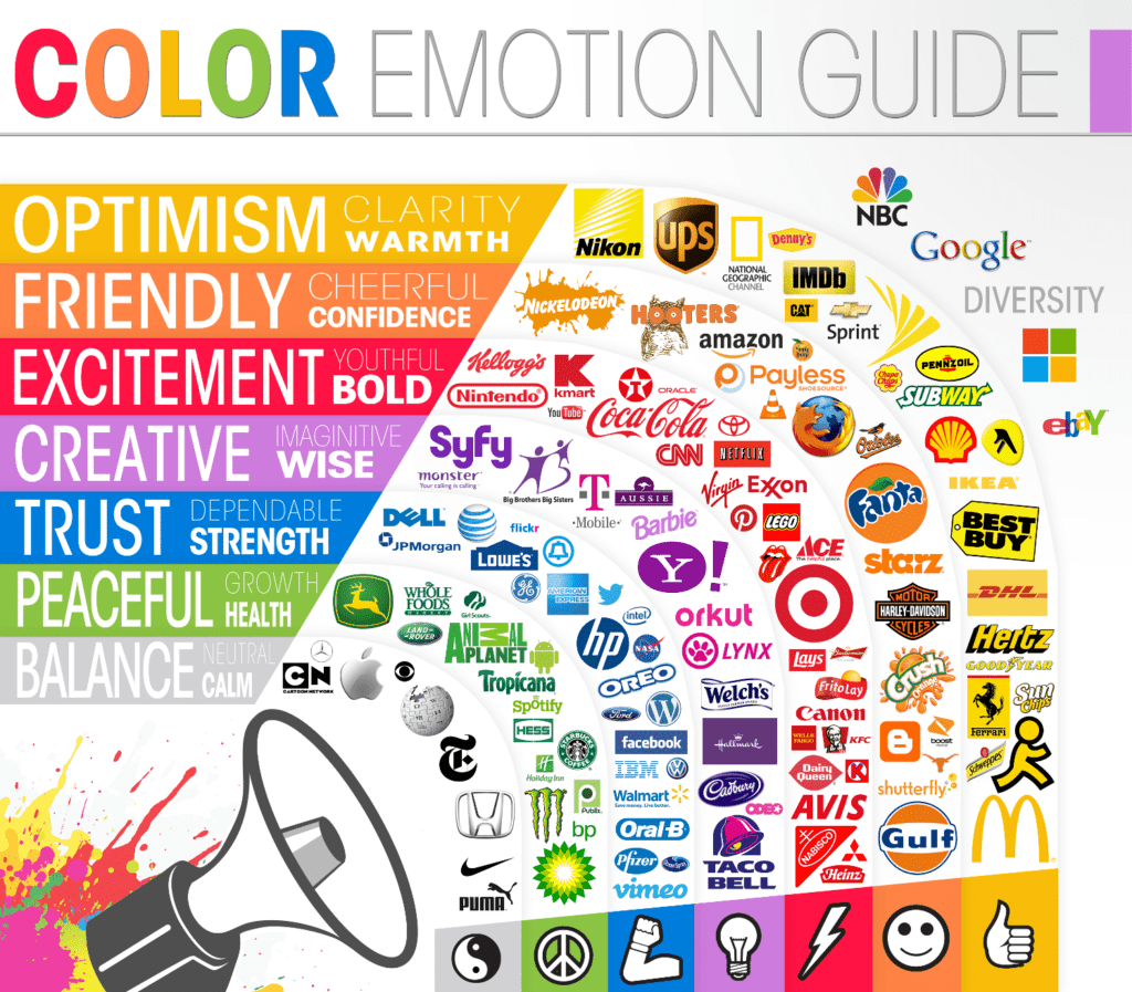
Image source – thelogocompany.net
- Red – Energy, passion, urgency (e.g., Coca-Cola, YouTube).
- Blue – Trust, calmness, professionalism (e.g., Facebook, Twitter).
- Yellow – Happiness, optimism, attention (e.g., McDonald’s, Snapchat).
- Green – Growth, health, nature (e.g., Starbucks, Whole Foods).
- Black – Luxury, sophistication, power (e.g., Chanel, Nike).
- White – Simplicity, purity, minimalism (e.g., Apple, Tesla).
Cultural Differences in Color Perception
Color meanings can vary across cultures. For instance:
- In Western cultures, white symbolizes purity, while in some Asian cultures, it represents mourning.
- Red is seen as lucky in China but can signify danger in other regions.
The Importance of Color Palettes in Design
What is a Color Palette?
A color palette is a set of colors used consistently in a design to establish brand identity and maintain visual harmony.
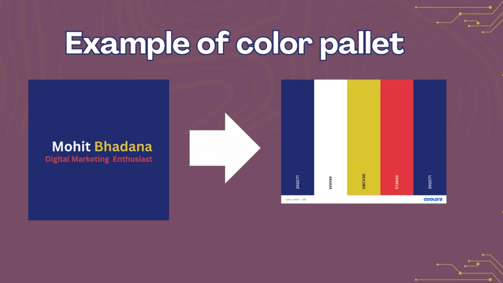
Use this tool to create a Free color pallet for your brand or design.
Choosing the Right Color Palette for Your Design
- Consider the target audience and industry.
- Use color contrast for readability.
- Maintain brand consistency across all visuals.
Case Studies: Successful Use of Colors in Branding
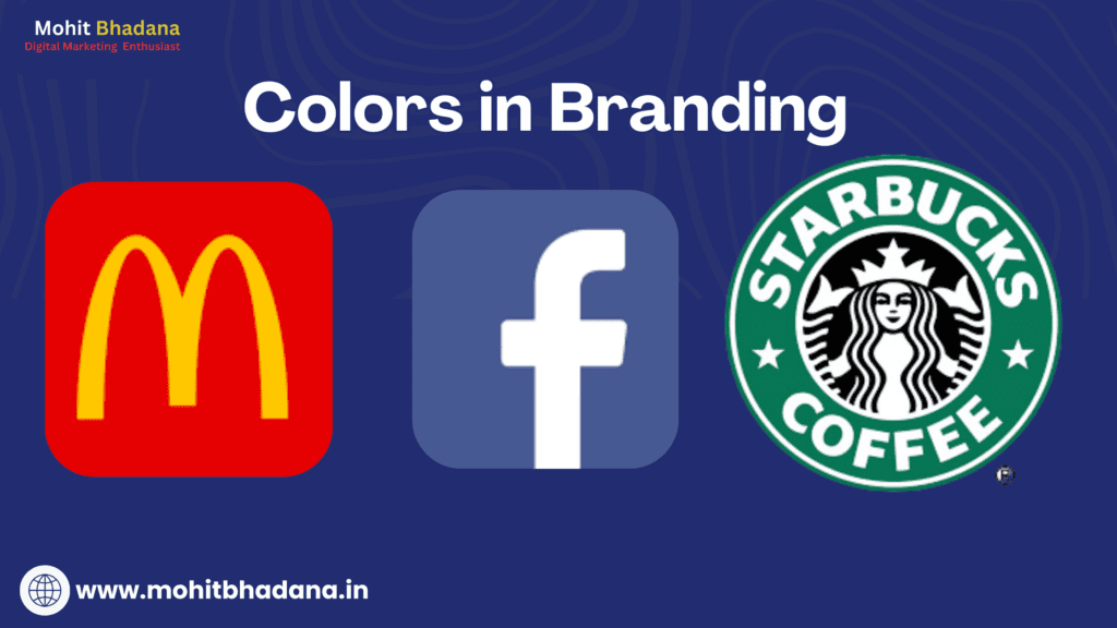
- McDonald’s – Red and yellow create excitement and stimulate appetite.
- Facebook – Blue instills trust and encourages engagement.
- Starbucks – Green represents sustainability and freshness.
Check How many types of logos are there
“Colors are the silent storytellers of any design, speaking directly to the viewer’s emotions and influencing their perceptions.”
Conclusion
Graphic design, color psychology, and color palettes work together to create impactful visuals that influence perception and behavior. By understanding these elements, designers can craft compelling designs that connect with audiences on a deeper level. Whether designing a logo, website, or advertisement, thoughtful color selection plays a crucial role in visual storytelling. Next time you embark on a design project, leverage the power of color to create memorable and engaging experiences.
FAQs
1. What is the role of color psychology in graphic design?
Color psychology helps designers create emotional connections with audiences by using colors that evoke specific feelings and behaviors.
2. How do I choose the right color palette for my brand?
Consider your brand message, target audience, and industry standards. Use complementary colors for contrast and consistency.
3. Why do different colors evoke different emotions?
Colors are linked to psychological responses based on cultural associations, personal experiences, and natural instincts.
4. What are some free tools for selecting color palettes?
Coolors, Adobe Color, and Canvas color palette generators are great tools for creating harmonious color schemes.
Bonus – Get Canva Pro at the best prices
5. How do brands use color psychology in marketing?
Brands use specific colors to evoke emotions and influence purchasing decisions, such as red for urgency in sales and blue for trust in finance.


Digital Marketing Strategist , Consultant & Trainer